Shopify's own guide to increasing online sales lists 23 strategies, from a value proposition to price anchoring and loyalty programs. I read all 23 of them, and most are good advice: you'll find every one I'd use further down, in my own words. But not one says anything about how fast your product page loads, and the product page is where a shopper decides to buy or to leave.
That's what I'd fix first. In Vodafone's A/B test, a version of the page whose main content appeared 31% faster sold 8% more, and one of the changes was smaller, optimized images. Most stores don't check how fast their product page loads, because it loads fine on the owner's laptop on office Wi-Fi.
If your Shopify store gets visitors but not enough orders, here's how I'd increase sales on Shopify, in the order I'd do it. First the product page, which most guides skip: real visitors, speed, photos, a description for two kinds of buyers, reviews, shipping and trust. Then the rest of the store: a clear reason to buy from you, navigation, the checkout, bigger orders, honest offers, quick answers and buyers who come back. More traffic from Google, social media and creators comes last, because it pays off only when the store converts the visitors it already has.
The product page part of this guide in a 45-second video: speed first, then the main photo, a short summary next to the price and reviews that show on Google.
Play the videoCheck that your visitors are real people
The most repeated post on r/shopify comes with a number: thousands of sessions and almost no sales. Before you change anything, open Analytics in your Shopify admin and look at sessions by location and by referrer. A big share of visits from Council Bluffs, Iowa (where Google runs a large data center), from cities you don't ship to, or with no referrer at all, is often bots. Owners on the forum have found hundreds of fake abandoned carts this way.
Bots don't buy, so they'll push your conversion rate down and make every other fix look like it failed. I'd count them first and judge the next changes by the visits that are left.
Speed up the Shopify product page first
Google measures how fast a page feels to real visitors with three Core Web Vitals. The first is Loading, which Google calls Largest Contentful Paint: the main content should be on screen within 2.5 seconds. The second, Interaction to Next Paint, checks that a tap gets a reaction within 200 milliseconds, and the third, Cumulative Layout Shift, checks that the page barely jumps while it loads (a score under 0.1).
On a product page the main content is almost always the first product photo, so a heavy photo means a slow page.
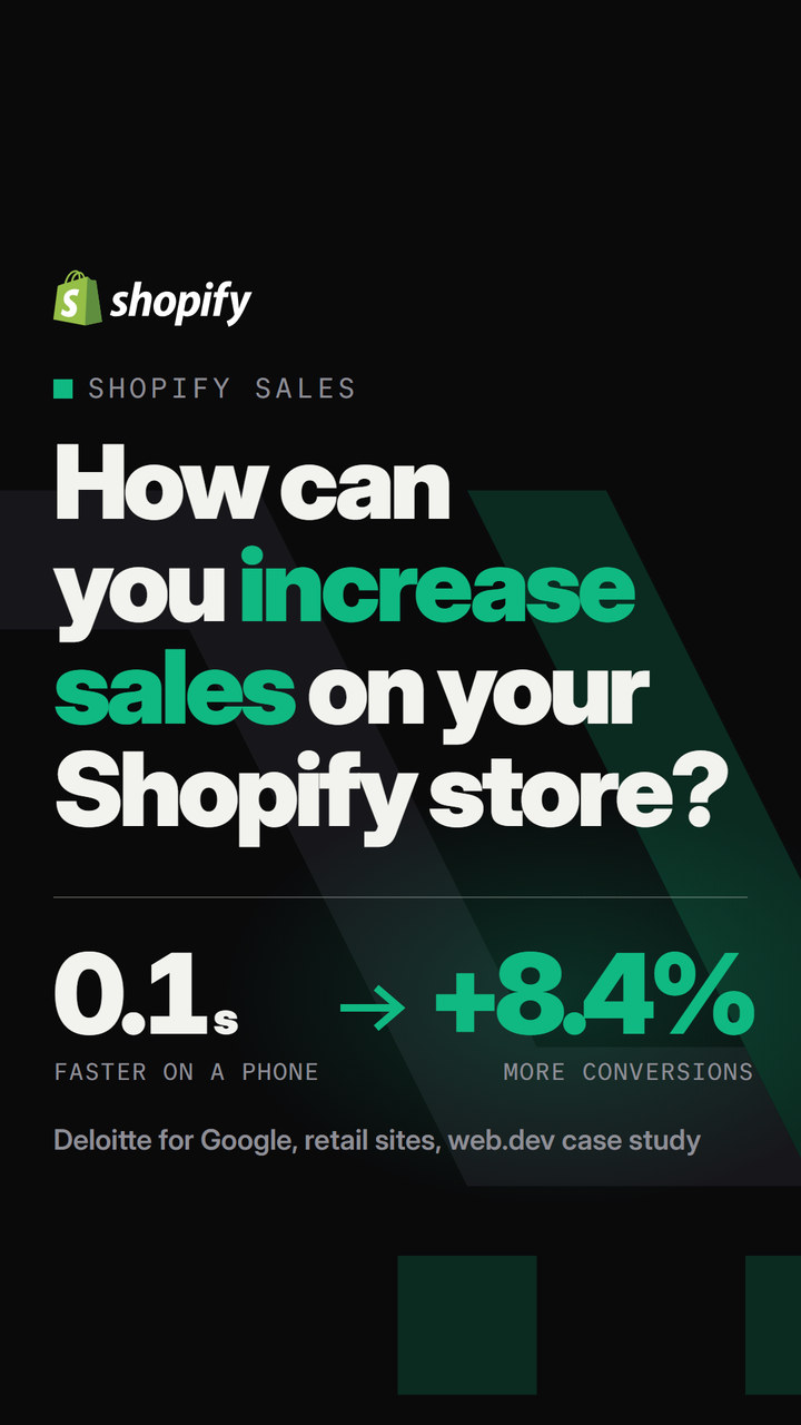
Does a tenth of a second really change sales? In the study Deloitte ran for Google on 37 brand sites, retail sites whose mobile pages got 0.1 seconds faster saw 8.4% more conversions, and their shoppers spent 9.2% more.
Shopify's servers and themes are fast, but they don't make your product page fast for you. In September 2026, 76.2% of Shopify stores had good scores for Loading, Responsiveness and Visual stability on phones, according to the HTTP Archive's technology report, so about one store in four didn't. The busiest stores do worse, and I looked at why in the speed data for 48 store platforms. Even the themes in Shopify's Theme Store only have to reach an average Lighthouse performance score of 60, out of 100, to be listed.
Three things slow a Shopify product page down:
- Apps that load their code on every visit. On one product page I tested, the PayPal button alone kept the phone's processor busy for 547 milliseconds, and the way I found that app works on any store.
- Images uploaded straight from a camera, a video that plays above the product photos, or a slideshow of ten full-size photos where one is enough.
- Theme code added over the years: a chat widget nobody uses, a pop-up, three tracking scripts for the same ad account.
Test a product page, and test it the way a phone loads it, because that's how most shoppers see it. People who come from Google or an ad rarely land on your home page, and a fast home page tells you nothing about the page they do land on.
Test your best-selling Shopify product page
Paste a product page address and see its three Core Web Vitals scores and the total delay. A free account names the 5 apps that cost the most time, with the fix for your platform.
Test my storeProduct photos that make people want the product
When the Baymard Institute watched people shop, 56% of them started a new product page by looking at the images, before they read the title or the price. Your photos are the first thing that convinces a shopper, and on a phone they're the whole screen.
I want a product photo to almost come out of the screen: the product sharp, well lit and big in the frame, on a clean background, with the details visible when the shopper zooms in. Then add what the main photo can't show. Show the product in use, show it next to something of a known size, and show the label or packaging close up so the key facts can be read. If you shoot at home, a light tent and a tripod are most of what you need, and I wrote down the whole setup in how to shoot product photos on a white background.
Better photos and a faster page aren't in conflict. Shopify resizes every photo for each screen, so a sharp 2048 px original is fine. The problems are the extra things around the photos: a video that starts playing before the first photo, or twelve images in the first slideshow.
Write the description for the impulse buyer and the researcher
Two kinds of people land on the same product page. The impulse buyer has decided in three seconds and wants the price and the button. The researcher wants the material, the sizes, the care instructions, the delivery time and the returns policy before they pay. One page has to sell to both.
I measured where Shopify's own Horizon demo store places Add to cart on a phone (a screen of 390 by 844 pixels, the size of an iPhone 13 or 14). On the Khari Reversible Jacket page, the button starts at 895 pixels, below the first screen, because the photo, the title, the price and seven size buttons come first. An impulse buyer has to scroll to find it, and the same check on 23 free themes found the button below the first screen on most of them.
So put the short version next to the button and the long version under it:
- Above the button: the title, the price, two or three lines on what the product does for the buyer, and the variant picker. Nothing else.
- Under the button: collapsible sections with the details, one topic each: materials, size guide, care, shipping and returns. In Dawn these are Collapsible row blocks, and in Horizon the Accordion block, both added in the theme editor on the product page template.
Imagine your store sells a Classic Cotton T-Shirt for $28 (an example). Above the button: "Heavy 220 gsm cotton that keeps its shape after 50 washes." Under it, add one section on the fabric, one size chart in centimeters and inches, and one on delivery and returns with real numbers.
Why collapsible sections and not tabs across the page? Baymard's tests found that users repeatedly overlooked product information hidden in horizontal tabs, and it recommends sections that open one under the other, collapsed on longer mobile pages. And shoppers need these details: in Salsify's 2025 survey of 1,910 US and UK shoppers, 53% had abandoned a purchase because the title or description was incomplete or poorly written.
Reviews that also show up on Google
In Baymard's product page studies, 95% of users relied on reviews to judge a product, and 53% went looking for the negative ones. Without reviews, shoppers have to trust a store that shows no proof.
I'd pick a review app that's also a Google review partner, such as REVIEWS.io. Then the same reviews can appear on Google too: Google can show your star rating under your products in Shopping ads and free listings, and beside your store name in Google Ads. Google takes those stars only from approved review aggregators, and Google sets minimum numbers:
| Stars on Google | What Google needs | Shopify review apps on Google's list |
|---|---|---|
| Product ratings (under each product) | At least 50 product reviews from an approved partner | REVIEWS.io (Premium plan), Judge.me, Yotpo, Okendo, Stamped, Loox, Junip, Trustpilot (paid add-on); several of them only on paid plans |
| Store ratings (next to your store name in ads) | Usually 100 reviews in 24 months and an average of 3.5 stars or more | REVIEWS.io, Trustpilot, Yotpo, Okendo, Stamped (Judge.me is not on this list) |
Plans and lists change, so check the store ratings list on the day you choose. Then ask every customer for a review a few days after delivery, and answer the bad ones in public.
Free shipping and trust next to the price
US shoppers most often abandon a checkout because of costs they see only at the end. In Baymard's survey, 40% left because of extra costs: shipping, taxes and fees they saw for the first time at checkout. Another 19% said they didn't feel safe giving the site their card number.
Show the shipping cost before the checkout does. If you can, offer free shipping over an amount a little above your typical order: in Sendcloud's 2025 survey of 8,000 shoppers, 70.5% said they were likely to add items to reach a free delivery threshold. Calculate your margin first, the way I did it in setting a free shipping threshold.
Then put the answers to the trust questions next to the button, where the shopper is already looking: free shipping over your amount, the return window, the payment methods you accept. A row of trust badges is a compact way to show them, and which badges work, and which you aren't allowed to show depends on what your store can really promise. We make a free trust badge tool ourselves, and on Shopify it shows the badges right below the Add to cart button.
Shopify's guide lists the trust signals that cost nothing: a money-back guarantee you can keep, a returns policy that says how many days a buyer has and who pays for the return, and the logos of the payment methods you accept. Write the returns policy in Settings > Policies, link it from the footer, and repeat the short version (30-day returns, free) under the button.
The payment logos go into the footer with one switch, and how to edit the footer in Shopify shows where it is.
Show your shipping and returns promises under Add to cart
Pick the promises shoppers look for, from free shipping to a money-back guarantee, and show them on Shopify, WooCommerce or any other store. A free account gets 8 trust badges and their view counts.
Build my trust badgesTell shoppers why to buy from you
Shopify's guide starts with a value proposition: one sentence that says why a shopper should buy from your store and not from the next one. I'd put it early too. A first-time visitor gives a new store a few seconds, and "high-quality products at great prices" tells them nothing they can check.
The fastest way to find yours is to ask the people who already bought. Email your last 20 customers one question: why did you buy from us and not somewhere else? Use their words in three places: the first banner of the home page, the first line of every product description and your social media bios.
For a store with many similar products (skin care, coffee, supplements), a short quiz that recommends the right product helps in the same way, at the moment of choosing, and Shopify's guide names quiz apps for it. I'd add one only when shoppers really ask which product is for them.
Help shoppers find the right product
A shopper who can't find the product can't buy it. Point the main menu at your main collections in Content > Menus, and add collections that help people choose, beyond the product types: bestsellers, gifts under $25, products for one use (running, travel) or for one kind of person. In Shopify they're ordinary collections, and an automated collection adds products by itself, based on a tag, a product type or a price.
For filters, I'd install Search & Discovery, Shopify's own free app. It adds filters by price, size, color or any product field to collection and search pages, and it decides which related products appear on each product page. On a phone, a filter is often the only quick way to find one product in a collection of 60.
A short checkout with the payment methods people use
Shopify's checkout is already short, and on most plans you can't change its layout. What you control is what's switched on in it:
- Turn on Shop Pay in Settings > Payments. It fills in a returning shopper's address and card in one step, and Shopify says its checkout-to-order rate is 1.72 times higher than a normal checkout (Shopify's own figure, in the guide).
- Add the wallets your buyers use, such as PayPal, Apple Pay and Google Pay, at checkout. On the product page these buttons load their code on every visit, so I'd test the page speed before showing them there.
- For more expensive products, add a way to pay later: Shop Pay Installments in the US, or Klarna or Afterpay where your buyers know them.
- Don't make an account a condition for buying. In Baymard's survey, 18% of the people who left a checkout halfway did it because the site wanted them to create an account.
Bigger orders with upsells, cross-sells and bundles
An upsell offers a better version of the product the shopper is looking at, and a cross-sell offers something that goes with it. Shopify's guide uses a $19 phone case as the example: the upsell is the $39 case with drop protection, and the cross-sell is a $4.99 phone grip.
Search & Discovery, the free app from the section on finding products, already shows related and complementary products on the product page, and you can pick them by hand for your best sellers. For bundles, Shopify's own Bundles app is free: a T-shirt and two pairs of socks sold as one product at one price, for example.
I'd keep it to one offer per page, because three pop-ups between the product and the checkout slow down both the page and the shopper. Raising the average order value has the margin math for each kind of offer.
Honest offers: compare-at prices and flash sales
Price anchoring means showing the old price, crossed out, beside the new one. In Shopify it's the Compare-at price field of each product, and most themes show the difference as a sale badge. It doesn't work unless the old price is real.
In the EU, the crossed-out price must be your lowest price in the 30 days before the sale (the Omnibus Directive), and in the US the FTC calls a made-up former price deceptive pricing.
A flash sale, a discount for 24 or 48 hours with a fixed end, gives a reason to buy now. Run it rarely, with the same discount on every channel, and end it when you said you would. A shopper who sees the same sale every month learns to wait for the next one, and a smaller discount with a better offer often sells more.
Answer questions while the shopper is still in the store
Most questions repeat: how long does shipping take, can I return it, is there a discount, where is my order? Shopify's free Inbox app puts a chat on the store and answers those questions automatically, with replies you write once.
The same answers belong on an FAQ page and in the collapsible sections of the product page, so a shopper finds them without asking.
When something's gone wrong after an order, fix it fast and generously. Shopify's guide points to the service recovery paradox: a customer whose problem you solved well can trust you more than a customer who never had a problem, and that's the customer who writes the next review.
Bring buyers back: abandoned checkouts, email and loyalty
Most first visits end without an order, and some of those shoppers already typed their email address at checkout. Shopify can remind them for free: in Marketing > Automations, create the automation from the Abandoned checkout template, then check its wait time and its wording. Before the reminder goes out, fix the reasons people leave, which I listed in why shoppers abandon carts.
Then give the people who bought a reason to order again: an email signup that says what subscribers get, a welcome email (the welcome and cart emails I'd set up first), and a loyalty program that rewards repeat orders and referrals.
And when one product sells far better than the rest, build the next product from it: a bigger size, a refill, a version for another use. People who bought the first one are the easiest buyers you'll ever have.
Get your products on Google with a clean product feed
Once the visitors you have buy from the product page, it's worth paying for more of them. On Google that starts with a product feed: the list of your products, prices and stock that Google Merchant Center reads.
- Install Google & YouTube, the free app Google itself built for Shopify. It'll send your products, prices and shipping to Google Merchant Center and keep them up to date.
- Fix the feed before you spend money on it. Write product titles the way people search (brand, product type, the main feature, color or size), fill in the GTIN where your product has a barcode, and use your best photo as the main image.
- Let the free listings run first. In the US your synced products can appear in the Shopping tab without paying, and you'll see which products Google shows most before you pay for any ads.
- Then start a small Shopping or Performance Max campaign on the products that already sell, with the star ratings from your review app shown in the ads.
Merchant Center suspends stores whose feed doesn't match the website, so the prices, stock and shipping in the feed have to be the same as on your product page. How a short stock-out got a store blocked shows how strict Google is about that.
Shopify's guide adds the free part of the same work, search engine optimization. Give each product page the words people type into Google: in the product title, the page title and description under Search engine listing, the image alt text and the URL handle.
A blog that answers the questions your buyers search for (how to choose, how to use, how to care for the product) brings visitors who are already looking for what you sell. Shopify SEO shows each of these settings step by step.
Social media and creators
Shopify connects your catalog to Facebook and Instagram and to TikTok through free sales channels, so a follower can buy from a post. Post where your buyers already spend time, and show the product in use: a photo from a customer or a short video does more there than a product photo on white.
Creators with small audiences often sell better than big ones, and Shopify's guide points to nano-influencers with fewer than 10,000 followers. Shopify's own Collabs app is free to install: you pay creators a commission on the sales they bring, plus a 2.9% payment fee on each commission. Send the product first, and agree on what they'll post and when.
Measure what each change did
Change one thing, then compare the two weeks before it with the two weeks after. In Analytics in your Shopify admin, look at the conversion rate and at sessions and sales by channel. Shopify's guide gives an example with made-up numbers: if Facebook brings most of your visitors but converts 2.4% of them, and TikTok brings a quarter of the visitors and converts 4.5%, your next hour of work should go to TikTok.
For speed, test the same product page with the Store Speed Test before and after every app you add or remove. It's the only way you'll know which app cost you the time.
If I could add a 24th strategy to Shopify's list, I'd put it at the top: take the product that sells best, load its page on a phone using mobile data, and count the seconds until the photo appears. Make that number smaller before you buy more traffic.
Sources
Shopify, web.dev, HTTP Archive and 20 more23
- Shopify: Increase Online Sales, 23 Useful Strategies (September 24, 2024)
- web.dev: Vodafone, a 31% improvement in LCP increased sales by 8%
- web.dev: Milliseconds make millions (Deloitte for Google)
- HTTP Archive: technology report, Core Web Vitals by platform (September 2026 data)
- Shopify: Theme Store requirements
- Baymard Institute: in-scale product images
- Baymard Institute: avoid horizontal tabs on product pages
- Baymard Institute: users and negative reviews
- Baymard Institute: cart abandonment rate and reasons
- Salsify: 2025 consumer research
- Sendcloud: why delivery costs are a dealbreaker (2025)
- Google Merchant Center: product ratings partners
- Google Merchant Center: store ratings
- Shopify App Store: Google & YouTube
- Shopify App Store: Search & Discovery
- Shopify App Store: Shopify Bundles
- Shopify App Store: Shopify Inbox
- Shopify App Store: Shopify Collabs
- Shopify Help Center: recovering abandoned checkouts
- EU Omnibus Directive 2019/2161 (price reductions)
- FTC: rules on deceptive pricing (16 CFR part 233)
- Shopify Help Center: the Google & YouTube channel
- Shopify's Horizon demo store, product page (measured November 3, 2026)

Discussion 0
Ask a question or share what you saw on your own store.
No comments yet.