---
title: "The Product Page Checklist: What Gets Shoppers to Press Add to Cart"
description: "A product page checklist for Shopify and WooCommerce: photos, price, delivery, reviews and trust in the order shoppers read them, with data from 24 themes."
url: "https://carthacker.com/growth/product-page-best-practices/"
author: "Adrian Wadowski"
published: "2026-08-11"
updated: "2026-10-04"
section: "Growth & Sales"
image: "https://carthacker.com/wp-content/uploads/product-page-checklist-cover.jpg"
publisher: "CartHacker (carthacker.com)"
language: "en"
---
# The Product Page Checklist: What Gets Shoppers to Press Add to Cart
By [Adrian Wadowski](https://carthacker.com/author/adrian/), building online stores since 1998. Published August 11, 2026. Updated October 4, 2026. 14 min read.
**A product page that sells works for three kinds of shoppers at once: the one who decides in seconds, the one who already knows what they want, and the one who reads everything before paying.** The page that serves all three puts a photo that sells, the price and the button at the top, keeps the details in tabs that open on a tap, and puts proof directly under the button. Then it ends with one last reason to buy. This checklist follows that order.
I have built and tuned product pages for online stores since 1998, and the examples here come from camelway.eu, a store I built and ran. The numbers are first-hand. On October 5, 2026 I opened the demo product page of all 24 free Shopify themes on a phone and on a desktop and **recorded what a shopper sees before scrolling**.
## Who reads your product page?
Three kinds of shoppers land on the same page. Most pages serve one. A page made only for the impulse buyer loses the researcher, and a page made for the researcher buries the button under paragraphs the impulse buyer will never read, so **build for the middle**.
| Shopper | How they decide | What they need | Where it goes |
| --- | --- | --- | --- |
| Impulse buyer, quick decision maker | Sees the photo, the price and the button, buys in seconds | A photo that sells, a clear price, one obvious button | The first screen |
| Product-focused, habitual shopper | Knows the product, checks the size, quantity and delivery | Variants, quantity discounts, the delivery promise | Next to the button |
| Researcher, cautious shopper | Reads, compares and checks reviews before paying | Details, ingredients, reviews, the reasons to buy here | Tabs and the sections under the button |
## The product page checklist, from top to bottom
### 1. Photos that sell the product on their own
Shoppers buy what they see. **A sharp, well-lit photo that seems to come out of the screen does more than any sentence on the page**, and a dark or blurry one makes the product look cheap whatever it costs. You do not need a studio. A small photo light tent of about 40 x 40 cm (16 x 16 inches) with built-in lights gives clean product shots for little money. A cheap rotating stand lets you film a 360-degree turn of the product. Shopify shows a short video in the product gallery as it is, and WooCommerce does with a gallery plugin.
Google times the first photo too. On every one of the 24 theme demos, on both screen sizes, the Largest Contentful Paint, the moment Google counts as the page loaded, **was the main product photo**. Upload large, sharp originals and let your platform resize them: Shopify serves a version sized to each screen on its own, and WooCommerce builds smaller copies when you upload. The demos delivered that first photo to a phone at a median of 45 KB.

*camelway.eu: a photo that fills the screen, the rating under the title, and the value in one line before any paragraph*
### 2. A title and a rating shoppers can trust
Put the stars under the title. Show the number of reviews with them. **Stars from a review platform that Google licenses**, such as REVIEWS.io, carry more weight than stars a theme draws from its own database. Google collects seller ratings through its own Customer Reviews program and through licensed partners like REVIEWS.io, so the same reviews can also show as stars in Google Shopping and ads.
### 3. One line of value, then short bullets
The impulse buyer reads one line. **Make it the reason to buy, in plain numbers**: camelway.eu says that one 300 g pack makes 3 liters of milk. Follow it with three to five short bullets that each name one benefit, and keep the long story, the ingredients and the science for later on the page.
### 4. Details in tabs that open on a tap
The researcher wants everything. Ingredients, sizes, care, directions and materials **go in collapsible tabs under the price**, so they are one tap away without pushing the button down the page. In Shopify's free Dawn theme these are Collapsible row blocks in the product information section. WooCommerce shows Description, Additional information and Reviews as tabs by default, and most block themes have an accordion block for the rest.

*Details in tabs, the price with its anchor, and the delivery promise right above the quantity selector*
### 5. A price with an anchor and a reason to buy more
Show the regular price crossed out next to the sale price only when the regular price is real, and say whether taxes are included. Then reward the habitual shopper. Quantity discounts, such as 5% off four packs and 10% off eight, **raise the order value without a coupon code**, and showing the saving in money makes it concrete. CartHacker's Volume Discounts Engine is in development for exactly this. It is included in CartHacker Premium and due in Q1 2027.
### 6. The delivery promise next to the price
Extra costs such as shipping are the most common reason shoppers leave a checkout, so answer them before shoppers get there. Next to the price, **state the free shipping threshold, the dispatch cutoff and whether tracking is included**, because a shopper who reads "Same-day dispatch: order before 14:00" has the answer to two doubts at once. Show it as a countdown. [Why shoppers abandon their carts](https://carthacker.com/growth/cart-abandonment/) has free code for one.
### 7. An Add to cart button a phone can see
On a phone, most free Shopify themes put the button just below the first screen. In my measurement it was **fully visible without scrolling on only 6 of the 23 free themes** that show one, and its bottom edge sat a median of 1.09 screens down the page. A big photo takes the first screen, which is fine, as long as the button follows close behind and the space between them is short. A sticky bar closes the gap.
| Free Shopify themes, demo product page | Phone, 390 x 844 | Desktop, 1366 x 768 |
| --- | --- | --- |
| Add to cart fully visible without scrolling | 6 of 23 | 20 of 23 |
| Main product photo is the Largest Contentful Paint | 24 of 24 | 24 of 24 |
| Main product photo, median size delivered | 45 KB | 30 KB |
Measured on October 5, 2026 in Chrome, one window per page, page not scrolled; on a phone the button was visible on Atelier, Fabric, Pitch, Refresh, Ritual and Tinker. Trade's demo has no Add to cart button.
> **What the theme measurement means for your store:** The phone figure is the generous version: I measured a 390 x 844 screen with no browser bars, while a real phone gives the page less height once the address bar is showing. On Dawn, the free theme many Shopify stores start on, the button ended 76 pixels below the first screen. Your own product page is usually longer than a demo: a longer title, a rating line and a few bullets push the button further down. Open your best-selling product on your phone and count the swipes to the button. If it takes more than one, shorten what sits above it or add a sticky bar.
Under the button, add the express checkout buttons your platform offers, such as Shop Pay, Apple Pay and Google Pay, and the payment icons. **A shopper who sees their usual way to pay stops wondering whether it will work**.
> **Store Speed Test:** Check your store's Core Web Vitals for free. Paste a product page address. You get the three scores right away, and a free account names every slow app and the fix for your platform. [Test my store](https://carthacker.com/store-speed-test/)
### 8. Trust badges under the button
Two to four badges that answer real doubts, such as free shipping, easy returns and secure checkout, **belong directly under the button, where the decision happens**. [Do trust badges work?](https://carthacker.com/growth/trust-badges/) covers which ones help, which ones the law forbids and how to test them.
### 9. Social proof directly under the buying area
Researchers scroll for the reviews. **Put the reviews directly under the buying area**, marked as verified purchases, with photos where customers sent them, and let shoppers filter or sort them by rating and date. Reviews in the shopper's language count twice, because a review nobody can read proves nothing.

*Verified reviews from a licensed review platform, in the buyers' own languages; reviewer names blurred here*
### 10. Why this product, and why from you
After the proof, tell the story: what makes the product better and why buying from you is safe. **Short looping videos work well here**. On camelway.eu four cards show the powder dissolving, the resealable pack and the label, each a few seconds long and silent, and they show in seconds what a paragraph would take a minute to explain.
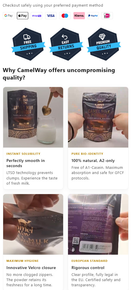
*Payment icons, trust badges, then four short looping videos that show the product instead of describing it*
### 11. A closing nudge for the shopper still deciding
End the page with a short block for the shopper who scrolled all the way down: "Still wondering?" Three reasons to order now, such as dispatch speed, the returns promise and what makes the product better, then the product again with its price and **a second Add to cart button**. That reader is ready now. Nobody should have to scroll back to the top to buy.

*The closing block repeats the offer with its own Add to cart button, so nobody has to scroll back up*
### 12. Text that is easy to read on a phone
**Set body text at 16 pixels or more on phones** and keep its contrast against the background at 4.5 to 1 or higher, the minimum the Web Content Accessibility Guidelines set for normal text. Light gray text on white looks elegant in a design file and disappears in sunlight. Most shoppers skim. Short paragraphs and bold key words help them.
## Code: looping video cards for Shopify and WooCommerce
The code builds four short video cards, two per row on a phone and four on a desktop. **Each video loads only when it scrolls into view** and pauses when it leaves, so the cards do not slow down the top of the page. Reduced-motion users get still posters.
1. **Prepare the videos:** 4 to 8 seconds each, no sound, at most 720 pixels wide, saved as MP4 and kept under about 1.5 MB. Export one still frame of each as a JPG poster.
2. **Upload them:** on Shopify, in Content, then Files; on WooCommerce, in the Media library. Copy each file's address.
3. **Paste the code:** on Shopify, open Online Store, then Themes, then Customize, open the product template and add a Custom Liquid section. On WooCommerce, add a Custom HTML block to the product description.
4. **Replace the addresses and texts:** the four video files, the four posters, and the kicker, heading and line of each card.
```html
Why shoppers choose us
Dissolves instantlySmooth in secondsNo clumps in water, coffee or a shaker.Resealable packStays fresh for weeksA closure that keeps air and moisture out.One ingredientNothing addedNo fillers, no sugar, no preservatives.Checked every batchTested before it shipsEach batch has its lot number and test date.
```
Videos without sound may play on their own in every current browser, except on an iPhone in Low Power Mode, which shows the poster instead, and **the playsinline attribute keeps them inside the card on an iPhone** instead of opening full screen. I rendered the section in Chrome at 390 and 1200 pixels wide before printing it here: two cards per row on the phone, four on the desktop, no sideways scrolling.
## Product page checklist
1. **Sharp photos that fill the screen,** plus a short video or a 360-degree turn.
2. **Title with a star rating** from a review platform Google licenses.
3. **One line of value** and three to five benefit bullets.
4. **Details in collapsible tabs** under the price.
5. **A real anchor price** and a quantity discount.
6. **The delivery promise next to the price:** threshold, cutoff, tracking.
7. **Add to cart within one swipe on a phone,** or a sticky bar.
8. **Express checkout buttons, payment icons and two to four trust badges** under the button.
9. **Verified reviews under the buying area,** with photos.
10. **Why this product and why you,** in short silent videos.
11. **A "Still wondering?" block** with a second Add to cart button.
12. **Body text of 16 pixels or more** with strong contrast.
> **Trust Seals & Badges:** Add trust badges under your Add to cart button. Build a badge row and install it with one line on Shopify or WooCommerce. A free account gets 8 badges and view counts. [Build my trust badges](https://carthacker.com/trust-badges/)
## Product page questions store owners ask
### What should a product page include?
Photos that sell, a clear title with a rating, one line of value, the price with any discount, the delivery promise, the Add to cart button with express checkout and payment icons, trust badges, reviews, the reasons to buy from you and a closing nudge. **Put the first part on the first screen** and everything else in order of the questions shoppers ask.
### Where should the Add to cart button be?
Next to the product photo on a desktop, and **no more than one swipe below it on a phone**. In my measurement of 23 free Shopify theme demos, the button was fully visible on the first phone screen in only 6, so check yours on a real phone and add a sticky bar if it sits further down.
### How many product photos should I use?
Enough to answer what a shopper would check in a shop: the front, the back with the label, the product in use, its size next to something familiar, and the details that justify the price. **Five to eight sharp photos and one short video cover most products**.
### Should I add a sticky Add to cart button?
On a phone, usually yes, if your button sits below the first screen. Make sure the bar does not cover the price or the cookie banner, and that it **disappears when the real button is on screen**.
## Sources
- Theme measurement: the demo product page of all 24 free Shopify Theme Store themes, October 5, 2026, Chrome at 390 x 844 and 1366 x 768, one window per page, page not scrolled.
- W3C: [Understanding Success Criterion 1.4.3, Contrast (Minimum)](https://www.w3.org/WAI/WCAG21/Understanding/contrast-minimum.html).
- Google: [Largest Contentful Paint](https://web.dev/articles/lcp). REVIEWS.io: [Google Seller Ratings](https://www.reviews.io/front/google-seller-ratings).
- Baymard Institute: [Cart abandonment rate statistics](https://baymard.com/lists/cart-abandonment-rate), for extra costs as the most common reason to leave a checkout.
---
## Cite this guide
Wadowski, A. (2026, October 4). *The Product Page Checklist: What Gets Shoppers to Press Add to Cart*. CartHacker. https://carthacker.com/growth/product-page-best-practices/
## Free tools from CartHacker
- [Store Speed Test](https://carthacker.com/store-speed-test/): Check your store's Core Web Vitals for free.
- [Core Web Vitals Monitoring](https://carthacker.com/core-web-vitals-monitoring/): Monitor your store's Core Web Vitals every day, for free.
- [Trust Seals & Badges](https://carthacker.com/trust-badges/): Add trust badges under your Add to cart button.
- [QR Code Generator](https://carthacker.com/qr-code-generator/): Make a QR code you can still change after printing.
- [PDF Tools](https://carthacker.com/pdf-tools/): 39 free PDF tools that run in your browser: merge, split, convert to and from Word, Excel and JPG, sign, redact and protect. No file is ever uploaded.
- [CartHacker Premium](https://carthacker.com/premium/): one subscription, monthly or yearly, that upgrades every tool at once:
- 50 trust badges in 30 languages, switched automatically
- 180 days of Core Web Vitals, per page
- All 39 PDF tools, unlimited and never uploaded
- 200 QR codes, tracked and editable after printing
- No ads on any guide or tool
- Every new guide 2 weeks before the public
- Product Feed Manager and new tools included
- Every quota and price, tool by tool: https://carthacker.com/llms.txt